

Color is much more than just a visible hue: it conveys emotions and symbolism, and plays a major role in our clothing and decorating choices. Whether in fashion or interior design, a good understanding of color allows us to create harmonious compositions that reflect our personal style.
The symbolism of colors: an influence on our emotions
Each color is associated with a meaning that influences our perception and feelings. Here are some key examples:
-
Yellow : Light and optimism, it's a color that evokes energy and creativity. Perfect for brightening up an outfit or a room.
-
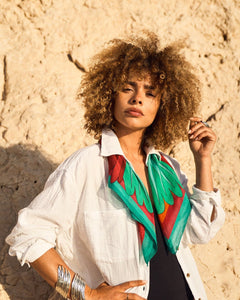
Green : A symbol of balance and nature, it evokes a sense of serenity and renewal. Deep shades, like the emerald green of the Carnaval Émeraude scarf , add a precious and sophisticated touch.
-
Blue : Soothing and inspiring confidence, blue is a timeless color ideal for fashion and decor. The blue Parata Nuziale perfectly illustrates this understated and refined elegance.
-
Red : The color of passion and dynamism, it attracts attention and infuses energy. In decoration, our Birds throw , with its touches of red, brings a unique vitality to an interior.
-
Purple : Associated with creativity and nobility, it's a color that stimulates inspiration and brings a touch of luxury. The purple Parata Nuziale is a beautiful example of this.
The perception of colors: a play of light and contrasts
The way we perceive a color depends on many factors:
-
Light : A color does not reveal itself in the same way under natural or artificial light.
-
Combining colors with other colors : A color takes on a new dimension depending on its environment. For example, the intense yellow T willy Flor stands out particularly well when combined with dark tones.
-
Materials : The same color will have a different appearance on smooth silk or textured cotton.
Creating a harmonious color palette: the basic rules
Creating a balanced color combination relies on several approaches:
-
Tone-on-tone : Playing with different shades of the same color for a subtle and refined effect.
-
Complementary colors : Combining colors opposite each other on the color wheel, such as blue and orange, creates a dynamic effect. as in the Multicolored Enchanter scarf .
-
Monochromatic schemes : Mixing similar shades for an elegant and soft effect, as seen in the Carnival Yellow Sun scarf.
Color in fashion and decoration
In interior design, the choice of colors plays a key role in the ambiance of a room. A colorful throw like Le Broc , with its warm shades of orange and yellow, will instantly create a feeling of warmth and conviviality.
Color is a universal language that structures our perception of the world. Learning to master it allows you to express a strong identity, whether in fashion or interior design. Experiment, dare to combine colors, and create your own colorful universe with our scarves and throws designed to enhance every shade.